
Devensoft
Improving a highly flexible (customizable, complex, and over-complicated) acquisition and integration management software platform for M&A professionals
Consulting, UX Audit, Product Strategy, Research, UI Concept
Overview
From the very beginning, Devensoft has been proactive in gathering feedback from their users on a journey of continuously improving a platform that suits a very large number of departments and people in the space of mergers and acquisitions.
"Our main concern is that it's not the easiest to use - once you understand the order of operations it's seamless, but it's not intuitive."
Captured user reviews from different platforms

With known problems during the onboarding phase due to its complexity (the users needed between 6 and 9 sessions of dedicated training just to understand how the platform works and to set it up), and other parts of the platform were known to be counter-intuitive, also, their user interface coming up as highly inconsistent, our goal was to dig deeper and surface any other problem they might've missed, expose it and come up with possible solutions for improvement.

Scope & timeline
The scope of work was defined between the stakeholders
with the main goal being an in-depth
generative research alongside the UX audit to surface further issues and, secondary, a UX conceptual approach on how might we further improve the platform if given a free hand.
Timeline: 5 weeks
The teams
2 UX Researchers
1 Product Strategist
1 Product / UX Designer
1 Delivery Partner
VP of Engineering
VP of Partnership & Aliances
Director of Product
Principal Solution Architect
& Devensoft
Tools & platforms
Miro
Slack
Figma
Dovetail
Goal alignment workshop

Approach
Aligning for success - Establishing what 'success' would mean after finishing this exercise helped us understand what the client's needs are but also what areas of the platform they would like us to "handle with care". Non-goals are equally important to be defined during the alignment process, as it might take out a large chunk of the workload that usually one would approach if not instructed otherwise.
After reviewing the project key information and documentation repositories (customer-provided documents + knowledge base articles) and having all of our initial questions answered, we had a more clear vision of what our next steps would be and listed them as activities and deliverables throughout the five weeks of the project length.


Roles & assignments
UX Research
-
Stakeholders and User Interviews
-
Sample, recruitment, moderation guide, transcription, and analysis
-
Research report
-
Heuristic evaluation
Product Strategy
-
Project Vision and Goals
-
Product strategy
-
System modeling
-
Business Requirements
-
Facilitate workshops and activities
-
Project deliverables
that's me!
UX, Product Design
-
Market & Competitor Analysis
-
UX Teardown
-
Information Architecture
-
User Journey (Personas?)
-
Co-facilitate UX activities
-
Concept mockups
Competitive landscape analysis

Discovery and research
While Product was preparing the system modeling workshop (OOUX) in the background, one researcher and I started working on the moderation guide for the user interviews, in our effort of trying to understand as much as possible how the users are utilizing the platform, what are the most significant pain points, what areas they would like to be improved and why.
Devensoft provided and scheduled interviews with plenty of users, from simple ones to admins and executives. (the user types we are targeting are based on the proto-personas defined from gathered data and conversations with the stakeholders)
User interviews

Part of Research report

We scheduled twelve to fifteen interviews in the span of two weeks with three different types of users. We were mostly targeting their day-to-day operations/usage of different sections of the platform by asking them a mix of open and close-ended qualitative questions.
Realizing during the first interviews that there wasn't any pattern showing from their answers regarding any of the issues we were 'investigating', usage, or any problem whatsoever with the platform, we know something wasn't right.
It took us a minute to catch on, but Devensoft was setting up the interviews with very experienced users who were already feeling comfortable around the platform and couldn't see the forest from the trees.
We were back to square one after the first day.
But these experienced users brought valuable insights through their input, something we could turn into opportunities later on.
"It would be interesting to have a more dynamic reporting functionality, even this, the support from the dev to help the client, in this case, Accenture or whatever client to design a report that makes sense from the organization's leadership pov."
Navigation & taxonomy
Information architecture defines how users move through the platform, including menus, navigation bars, and other interactive elements and it should aim to provide clear and consistent navigation paths, allowing users to find relevant information quickly. This was not the case with Devensoft, where top navigation was clogged and overwhelming for the users and as confusing as the taxonomy they used, pushing away the users from their mental model.
It was clear that our goal here was to enhance the user experience by reducing cognitive load, improving findability, and supporting seamless navigation and exploration.
Devensoft's original navigation mayhem

User flows & personas
We mapped out the user flows for three different user types, Executives, Project Managers, and Administrators, and built different task scenarios for each just to make sure that the information is presented in a logical sequence, guiding users through the desired actions with minimized friction.
User flow - Executives

System modeling
The system modeling workshop (OOUX) was led by our Product strategist together with our OOUX-certified researcher. But as any curious designer should be, I asked to be there even if for awareness & to build some knowledge on this topic.
"Object-oriented UX (OOUX) is a method for structuring a space that emphasizes the objects – the things people interact with. It is a design method based on information architecture that is aimed at helping designers organize things in a manner that naturally matches up with the users' mental models."

Findings
Competitive analysis brought us insights into user expectations, common design patterns, and industry standards. This understanding would help us align our future UX designs with users' existing mental models, reducing learning curves and improving usability.
Through the analysis, we also identified some weaknesses in the platform's file management system, which was miles behind the others'.
The heuristic evaluation surfaced many usability issues, violating a lot of established best practices, ranging from minor usability concerns to critical problems that significantly impact user experience. Most of them fell in the Consistency and navigational clarity [4], Memory recognition ease [6], and Simplicity and information architecture [8] categories. The lack of visual hierarchy, no design guidelines, or any practice that would promote a cohesive user experience across the product was also problematic.
Note: I did not include anything from the heuristic evaluation process & PURE exercise findings here because of the scale & complexity we went through, even if I participated in most activities. I could build a separate case study just off of that.
Outcomes
Devensoft's modernization recommendations plan was put together in a form of a report, based on all the findings we had available after a month of working with the platform, it's creators, and their users.
A Gap analysis navigating through their Objectives from the current state to an ideal state together with the steps for them to take in order to reach from Thesis to Synergy faster.
The UX Research report would highlight our key findings from the users - which were not always great, but, taken with a positive mindset should be turned into opportunities for improvement.
As a result of the Heuristic evaluation analysis, a lot of usability issues were identified, and we highlighted some of the most notable ones.
Product strategy's key findings revolved around four main topics: Mental model, Navigation, Ontology, and Interface.
UI Concept
After spending many weeks learning about the M&A process, studying different platforms, besides Devensoft, and understanding how users actually work and interact with it, I felt we gathered plenty of meaningful insights about the users' needs, behaviors, and preferences, knowledge that we could now leverage and make the right design decisions when coming up with a new concept for their platform.
Clean concept - New navigation & layout

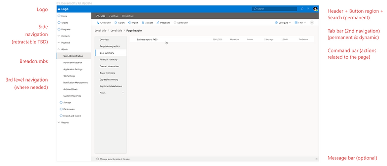
Because during goal alignment they had small doubts about a complete overhaul, we presented them with two options when it comes to improving the platform.
Option 1: An easier path, of small visual and structural adjustments but with a big impact on key usability pain points over the short term but not fixing all other problems we surfaced.
With this 'easier' option, we introduced left-side navigation and reconfigured their menu so that it makes more sense for the users. To reduce the training sessions, we added an onboarding phase with videos for the users in order to get familiar with the tool before actually jumping in. UI-wise we applied a style that was close to the tools they were using on a day-to-day basis (we knew from the research phase it was mostly tools from the Microsoft suite), which was closer to their mental model.
Dynamic onboarding
Home screen - before & after

Option 2: A cutting-edge User Experience (UX) concept design for a platform that aims to revolutionize the domain it operates in. Leveraging our extensive research and user interviews, the concept has been meticulously designed to address these pain points head-on, providing innovative solutions that enhance productivity, efficiency, and overall user satisfaction.
It offers a clean, intuitive, and visually appealing interface that ensures users can effortlessly navigate through the platform and perform complex tasks with ease. The design embraces simplicity, minimizing complexity and eliminating unnecessary steps or features, allowing users to focus on what truly matters.
Devensoft UI Concept teaser - Figma Prototype


Conclusion & takeaways
For me, the hardest part of this project was understanding a practice (M&A) that you don't usually come across. Unless you were lucky enough to sell your company or acquire one by now. If you have, congrats!
So getting into the shoes of these users was not something easy to accomplish, and navigating and learning a new platform like Devensoft, with a counter-intuitive interface and a steep learning curve - was even harder.
After presenting Devensoft with our findings and possible solutions for improvement, they realized the value of this exercise and how many great insights it brought, not only validating their initial hypotheses but surfacing other tacit needs from the users, needs that they weren't aware of.
The project report was delivered on a Thursday afternoon. The feedback was overwhelmingly positive. By the next Monday, a project extension of one year was signed, with one UX and one Research designer being assigned full-time to further enhance & improve their platform.

